A truly stunning and incredible video, showing the amazing ability of the human body. All filmed without diving equipment by free divers and shot with a Canon 5DMkII, which is fast becoming the industry standard for creative beautiful video.
Enjoy
Friday, 11 June 2010

Tuesday, 4 May 2010
A big block of metal
Well today I finished the main letterpress part of my final major project and here are some photos;


Over 4000 characters of metal type all set out and locked in the printing block, it's been a great week, frustrating at times but over all really enjoyable. Working with metal type has been really useful to help me understand more about typography and has given me a real appreciation for all kerning, leading, spacing etc that is normally so easy on the computer. I definitely feel this is the beginnings of a bit of an addiction and I'm already searching the net for letterpress proofing presses and metal fonts.
Sunday, 25 April 2010
A to Aardvark
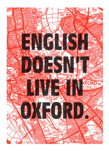
Well I've been playing around with a collection of bits and pieces and the beginning stages (from A to Aardvark as the James Murray might say) are starting to come together so thought I'd share a little online.
Still trying to refine what I'm doing and work on how the various elements I have planned will fit together best but heres a sneak peek.

Friday, 23 April 2010
Final project research
So I'm working on my final project of my Graphic Design degree and I've come across some great stuff ng the way while researching.
The project is about the dictionary, and about giving as much time and effort to those words that don't make it, these 'non words', as was given to those words that did.
To really express this I am in the process of creating a small dictionary of 'non words' that I plan to print using letterpress and screenprinting, something that I felt was fitting given that much like these non words if these old processes aren't used then they will be forgotten forever. So here are some of the nicest bits I've found while doing this project;


Letterpress Coasters from Paper Fortress on Vimeo.
Friday, 2 April 2010
Ravensbournes new logo
My attention has recently been drawn to the new Ravensbourne branding, on the whole I like it, it's stayed nice and clean and the 'cut' boxes used throughout look pretty good. However they seem to have completely forgotten about the logo.

It's a real shame, the Uni is moving into a brand new building with and is looking like it was going to launch itself with a bit of a bang until this. Hopefully they'll rework the logo into something that does the rest of the brand and the Uni justice. Until then we'll have to make do with the parodies - Check out the facebook group

Sunday, 24 January 2010
Eye Popping colour
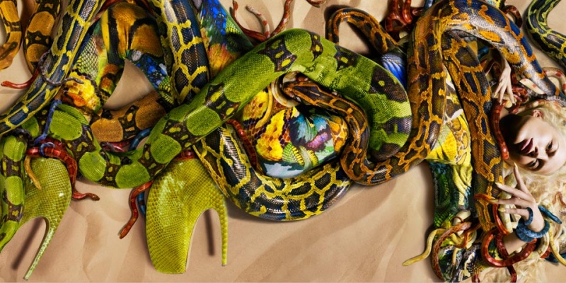
Alexander McQueen S/S 2010 : Raquel Zimmermann by Nick Knight
Have to say its a pretty amazing photo not sure if it shows off the clothes that well but it certainly makes your notice.Friday, 22 January 2010
Woops
Well I've been a bit slack updating my blog with dissertation, the new issue of cub and uni work back on. But now I am back at it all, I'll be updating my blog with in progress work and ideas from projects in the pipelines.
But here is the 5th issue of CUB for viewing pleasure, enjoy.

Subscribe to:
Posts (Atom)