Tuesday, 15 December 2009

Back on and straight off

Well, hopefully if all goes well I'll be back up with my 360at3 photo blog from thurday/friday.


However from Friday I'll also be flying away for christmas, so the posts will probably by a bit sporadic. Hopefully though by the time the new year roles round there will be a plethora of new 360's to kick start the new year off.


Wednesday, 2 December 2009

Libre Culture


Well after traveling on a 60mile round trip, lots of work with scalpels and numourous practice cuts I have now finnished a project on 'The Libre Manifesto' a manifesto that sets out the idea and benifits of an open source approach to creative ideas.

The manifesto is the basis of which many successful companies and ideas are based, wikipedia being the most successful of these, and dispite being a quite weighty text makes a lot of interesting points (have a read - http://en.wikisource.org/wiki/The_Libre_Society_Manifesto )

I'll soon be updating my website with this and a few other things but in the spirit of open source here are some pictures of the process.


Sunday, 29 November 2009

CUB steps up a notch

So with the new year brings a new approach to CUB. Through a few tweaks here and there, I'll now have a month to design each issue and this has meant something even more exciting.


CUB is getting a design team. More details to follow but hopefully it's going to mark the beginning of a definite jump in quality and I'm sure a load of new problems.


I'm really looking forward to getting to art-direct the magazine as well as design it. Here goes I guess.


ps. CUB's on Twitter - follow here


Saturday, 28 November 2009

Issue 520

Well this months issue has just made it to the printers and there is a sneak peak for you blog readers.


Cub Issue 520

The Devils In The Detail

Wow these are probably some of the best looking paint jobs I've ever come accross, still not sure if it beats a bike I saw covered in old postage stamps and clear gloss. See what you think here


Thursday, 26 November 2009

Updated confusion


An update of my earlier post

Wednesday, 25 November 2009

A little confusion

I'm having a bit of fun with this months issue of CUB and playing about with readability for an article of the seperation and confusion of Europe.


Work in progress, the background is going to contain an image not the block of colour and of course a load of other tweaks.


Saturday, 21 November 2009

Toxicity

Always nice to see people taking something and using it in an unexpected way.


Thursday, 19 November 2009

LEGO for MUJI Paper and Block Sets

You know those ideas you wish you had thought of, Bravo MUJI Bravo


LEGO for MUJI Paper and Block Sets


MUJI partners with iconic building-block company LEGO on a super fun new concept. Together they’re encouraging us to think outside the blocks (horrible, I know) by punching LEGO-sized holes in paper. The rest then becomes obvious – but wow – how innovative is that? Perfect really. Available November 27th at MUJI Japan – just in time for the Holiday season. US and European MUJI locations have yet to confirm stock.


[From LEGO for MUJI Paper and Block Sets]


Cheer up London


Well I've had a nice idea for a self initiated project that I'll be working on over the next few weeks. Recently London has seen its free papers fall by the wayside, with 'The London Paper' and 'London Lite' both cutting their losses and abandoning ship. This has meant that commuting londoners are now faced with less choice of what they read on their commute and in this time of recession grumpiness I think its time London smiled again.


So I'm going to take inspiration from by gone student activists and their love of single sheet screen printed newsletters/posters and create a free little something that brings a smile to the face of commuting Londoners.


I'm looking for any comedians or illustrators that want to do something for the love of it and give something back to this brilliant city. If your interested in helping out let me know.


Wednesday, 18 November 2009

Its a pity when

It's a pity when an idea that seems original and different turns out to be a complete rip off. I hope they worked with the original artist at least cause ti even use the same music is taking the mick a bit. Have a look at the two videos yourself, play them at the same time its quite shocking.


Tuesday, 17 November 2009

Friday, 13 November 2009

Seeing is beliving

One of the most inspirational videos I've seen in a long time, such a nice cause and use of open source technology


The Eyewriter from Evan Roth on Vimeo.


Members of Free Art and Technology (FAT), OpenFrameworks, the Graffiti Research Lab, and The Ebeling Group communities have teamed-up with a legendary LA graffiti writer, publisher and activist, named Tony Quan, aka TEMPTONE. Tony was diagnosed with ALS in 2003, a disease which has left him almost completely physically paralyzed… except for his eyes. This international team is working together to create a low-cost, open source eye-tracking system that will allow ALS patients to draw using just their eyes. The long-term goal is to create a professional/social network of software developers, hardware hackers, urban projection artists and ALS patients from around the world who are using local materials and open source research to creatively connect and make eye art.


This week the team behind the EyeWriter project released all the Source code, free software, DIY instructions, and eye tags by Tempt1 to the public at eyewriter.org


[From EyeWriter Source Code Released To The Public]


Sunday, 1 November 2009

Block

A little something to help combat creative block. http://creativeblock.monomoda.com/


A fun idea even if they are well known statements.

Thursday, 29 October 2009

Cub Issue 519

A little sneak peek of the new issue for everyone - click the picture to view


Fast Approaching

Reality


I feel the time is fast approaching where I will have to face facts. I shall be consulting my little book of ideas and actually having to pick ones to continue or finish. It's strange after 2 years of having time spare now I wish I'd done a bit more, oh well good ideas will last.


Cub Issue 519 (my 3rd issue) has just gone to print, off to check the proof of that later today. My 360degree project is going strong with almost 500 views in about 2 weeks if you havn't already have a look at www.360at3.blogspot.com. I'm beginning work on a project to address the number of people wearing bike helmets with Jenny Rice as well as weighing up which RSA brief to have a go at. Oh and that lovely thing called a dissertation is looming its head still.


As not to leave it on a downer look at these amazing photos I found from a new york photographer called Weegee here


Tuesday, 27 October 2009

The Art of Juggling

I have to admit I've never been much of a juggler. I never thought it would be much of a problem, I wasn't planning to join the circus and its not that great a party trick. However I have discovered that its a key part to a graphic design degree.

Issue 3 of CUB magazine is almost ready for print and in talks with a paper mill to get some different paper for certain parts of the magazine which could be fun.

My 360degree project is going strong, over 400 views and a couple of blog posts in 2 weeks isn't bad.

Uni wise It's a bit strange getting back into it all and balancing dissertation with project work and allowing myself to have a resemblance of a life. Oh well I'm sure it'll all come together soon enough.

Oh and to make it worse, I've had to start thinking about what happens after uni, anyone want to offer me a job?


Sunday, 18 October 2009

If a tree falls does anyone listen?

A really interesting art piece replacing the places logged trees used to be, with the sound they used to make. I really like how these are not just done digitally and that they are painstakingly made in order to fill the gap, I think it adds move value to the lost trees life.


"The white forms in these photographs are the sculptural manifestations of audio footage that was recorded along the border between Russia and Finland. Here the unique old-growth forests stand, The Green Belt of Fennoscandia. Recently these ancient trees are being logged for their valuable timber. There are only few remaining areas of ancient forest in Europe with the vast majority of the vanishing old-growth forests remaining are in the North of European Russia.


The soundwaves are actual objects, each is 6 metres high, reminiscent of the height of a tree, despite looking like digital intervention. I recorded them when the forest was still there. Then, when the trees had gone, I put the ‘sounds’ back to where they used to exist, sounds that look like trees that will never be heard again."


check out the rest of the pieces on the soundstills page at www.iratviga.com/


Saturday, 17 October 2009

Darkness

The initial solution to our recent project set by Mark Bonner from GHB Design


This is a poster that is designed to be put up over ad-shells, phone boxes or any other area that obscures the darkness during the night, to encourages people to embrace creativity and journey through the darkness.


During the day when the item causing the light is not lit up it appears at first glance to be a black poster but for those that choose to give into curiosity and have a closer look the words 'JOURNEY INTO DARKNESS' can be made out.


Light Off


The poster is printed on both sides and when the light comes on from behind the poster the light can only shine through the bit that hasn't been printed so it reveals its hidden message encouraging people who are out in the darkness to consider its possibilities.


Light On


Journey into darkness

Over the last week we have been working on a project set by Mark Boner from GHB Design, who was kind enough to come in and give us a great talk on Monday.

The project is an extremely open brief that asked us to pick and object or subject and to delve into its associated meaning and related ideas and to come up with a solution that uses an idea gleamed from our research.

We have been looking into the subject of darkness, and have been exploring the notions surrounding it. One of the most interesting things we looked at was how throughout history and spanning various darkness has been considered something to be scared of.


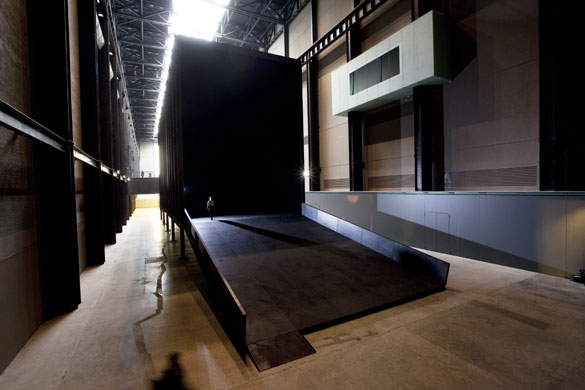
This is something that Miroslaw Balka's installation at the tate currently exploits in order to make people feel uneasy and unsafe. But through our research we found that the basis for these feeling as rooted in past problems where darkness was a time when we were at risk from predators and in fact has very little basis (apart from psychological) in todays world.

From this we started to explore the positives of darkness and found a wealth of inspirational poems, quote and pieces of work that reveled in the joy and peacefulness of the darkness. One of these that really resonated with us was the Oscar Wilde Quote that says...


"A dreamer is one who can only find his way by moonlight, and his punishment is that he sees the dawn before the rest of the world."


From this we wanted to create something to both encourage those 'dreamers' and also to promote more intrigue into exploring the darkness. We started exploring long exposure photographs in the darkness and wanted to create something that during the day would emulate the effect of gradually noticing details in the dark as well as make those who were in the darkness think of the potential for creativity etc that darkness brings.


Semi cut-out letters


Darren & Darkness

3D Type

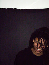
We began by creating 3D letterforms that we were going to photograph in the dark to create an image that at first glance appeared to be just a black image but after looking a bit harder details would be revealed within it.


Darkness Studio


This was one of our experiments during our photo shoot that allows you to see the type and below is the final image that we chose to use. Though it may not seem it on screen the phrase 'Journey Through Darkness' can be made out in print form.

Best viewed large - Click to enlarge.

web_darkness_light

Monday, 12 October 2009

CUB Issue 518

After a hectic week or so with content coming in a bit slowly. Issue 518 (my second issue as designer) is proofed, approved and ready for production.


This issue has had a little tweaking of the basic layout and I'm definitely happier with how this looks/feels on a whole so now just got to wait for it to get back from the printers.

A new regular feature.

I have started a little project for my third year.
It's called 360 at 3 and will involve me taking a 360degree photo every day at 3pm check out the daily photos at 360at3.blogspot.com

Enjoy

Friday, 24 July 2009

Printers & Paper

Good news, I've now joined forces with the brilliant Bethnal Green printer co-operative that are Calverts they have agreed to take on all 8 issues of CUB this year as well as helping me to find a lovely paper company based out of Bow in East London. So all future issues of CUB are going to be printed on a fantastic 100% recycled 140gm uncoated paper and with glorious vegetable oil based inks and produced/supplied within a 2 mile area.


I think I'm going to go have a tyre bonfire to celebrate.


Saturday, 18 July 2009

Before

I'm starting completely from scratch on the CUB design, and hoping that they will let me change pretty much everything. Below are a couple of snaps of one of last years issues.


Plans for the changes include:


- Size & Format - Currently cub is A4 the which I don't think is very practical for a free magazine that you want people to pick up and pop in their bags, so exploring a range of alternative sizes that will help it to stand out as not just another magazine on the shelf as well as make it easier for people to carry with them. This should also mean a higher page count making it a less flimsy item.


- Paper, Printing & Enviroment - At the moment cub is printed on the kind of paper that should only be used as a kebab flyer and at a printers located just outside the EU, conveniently EU sustainable printing rules don't have to apply. I'm currently trying to source some local printers and paper companies that we would be able to work with to improve the print quality as well help us to reduce the currently huge carbon footprint. Keeping my fingers crossed that I'll be able to find a nice recycled paper and printer that works with vegetable inks, we shall see.


- Photography & Illustrations - An area that really lets down the magazine at the moment is the quality of its visuals so on the hunt for some student photographers and illustrators to with with on future issue. If you know anyone get them to send an email to introducingluke (-at-) gmail.com

Thursday, 16 July 2009

CUB Magazine

After wanting to get involved with some more live briefs and get some production experience I have not managed to become the sole designer for Queen Mary University's student magazine called CUB.


I've agreed to take on the design of all 8 issues this year and this should hopefully be a real chance to have a lot of fun with a live project.


Check back for updates on how its all going.


Sunday, 31 May 2009

Sorry I'm late

Wow this stop motion video puts most others to shame, so fantastically crafted.


Sorry I'm Late from Tomas Mankovsky on Vimeo.


Thursday, 14 May 2009

Flat our winner

A really beautiful piece of product design, such a simple idea with an elegant solution. I look forward to seeing these everywhere.


via yankodesign

Wooster in the Whitehouse

Nice to see that the new Obama administration is engaging grass roots art collectives. Wooster have a nice article on how they felt about being invited, especially being an art group that champions street art and graffiti. Hopefully the UK government will be watching what's happening across the pond and taking notes.

MastheadbyBenjaminWeisman.jpg

The full article can be found here


Wednesday, 22 April 2009

WTF

What's the function? What's the Form, What's the failure?


Fun new blog to vent your frustrations about packaging http://weallsay-wtf.blogspot.com/


Tuesday, 21 April 2009

Website has had a bit of an update and there is now a couple of new projects up.


Obama - A chance to experiment with various layouts and grids in a 50 page commemorative book looking at voting statistics and the inauguration speech.


Deteriorate - An typographic code that deteriorates with use. Based on the way that the short-term memory of an Alzheimer patient breaks down quickest. The more you use a character the quicker it breaks down.