Saturday, 17 October 2009

Darkness

The initial solution to our recent project set by Mark Bonner from GHB Design


This is a poster that is designed to be put up over ad-shells, phone boxes or any other area that obscures the darkness during the night, to encourages people to embrace creativity and journey through the darkness.


During the day when the item causing the light is not lit up it appears at first glance to be a black poster but for those that choose to give into curiosity and have a closer look the words 'JOURNEY INTO DARKNESS' can be made out.


Light Off


The poster is printed on both sides and when the light comes on from behind the poster the light can only shine through the bit that hasn't been printed so it reveals its hidden message encouraging people who are out in the darkness to consider its possibilities.


Light On


Journey into darkness

Over the last week we have been working on a project set by Mark Boner from GHB Design, who was kind enough to come in and give us a great talk on Monday.

The project is an extremely open brief that asked us to pick and object or subject and to delve into its associated meaning and related ideas and to come up with a solution that uses an idea gleamed from our research.

We have been looking into the subject of darkness, and have been exploring the notions surrounding it. One of the most interesting things we looked at was how throughout history and spanning various darkness has been considered something to be scared of.
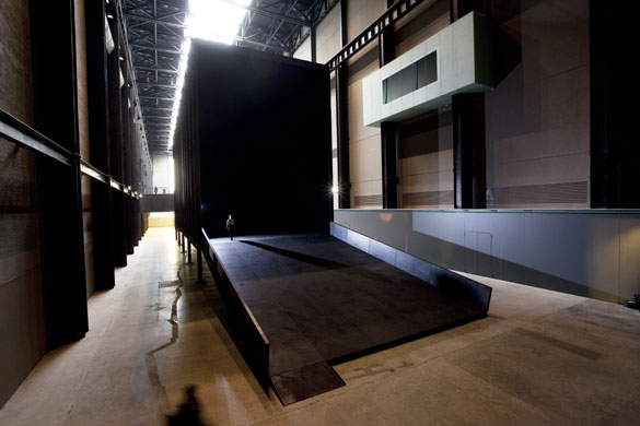


This is something that Miroslaw Balka's installation at the tate currently exploits in order to make people feel uneasy and unsafe. But through our research we found that the basis for these feeling as rooted in past problems where darkness was a time when we were at risk from predators and in fact has very little basis (apart from psychological) in todays world.

From this we started to explore the positives of darkness and found a wealth of inspirational poems, quote and pieces of work that reveled in the joy and peacefulness of the darkness. One of these that really resonated with us was the Oscar Wilde Quote that says...


"A dreamer is one who can only find his way by moonlight, and his punishment is that he sees the dawn before the rest of the world."


From this we wanted to create something to both encourage those 'dreamers' and also to promote more intrigue into exploring the darkness. We started exploring long exposure photographs in the darkness and wanted to create something that during the day would emulate the effect of gradually noticing details in the dark as well as make those who were in the darkness think of the potential for creativity etc that darkness brings.


Semi cut-out letters


Darren & Darkness

3D Type

We began by creating 3D letterforms that we were going to photograph in the dark to create an image that at first glance appeared to be just a black image but after looking a bit harder details would be revealed within it.


Darkness Studio


This was one of our experiments during our photo shoot that allows you to see the type and below is the final image that we chose to use. Though it may not seem it on screen the phrase 'Journey Through Darkness' can be made out in print form.

Best viewed large - Click to enlarge.

web_darkness_light

Monday, 12 October 2009

CUB Issue 518

After a hectic week or so with content coming in a bit slowly. Issue 518 (my second issue as designer) is proofed, approved and ready for production.


This issue has had a little tweaking of the basic layout and I'm definitely happier with how this looks/feels on a whole so now just got to wait for it to get back from the printers.

A new regular feature.

I have started a little project for my third year.
It's called 360 at 3 and will involve me taking a 360degree photo every day at 3pm check out the daily photos at 360at3.blogspot.com

Enjoy

Friday, 24 July 2009

Printers & Paper

Good news, I've now joined forces with the brilliant Bethnal Green printer co-operative that are Calverts they have agreed to take on all 8 issues of CUB this year as well as helping me to find a lovely paper company based out of Bow in East London. So all future issues of CUB are going to be printed on a fantastic 100% recycled 140gm uncoated paper and with glorious vegetable oil based inks and produced/supplied within a 2 mile area.


I think I'm going to go have a tyre bonfire to celebrate.


Saturday, 18 July 2009

Before

I'm starting completely from scratch on the CUB design, and hoping that they will let me change pretty much everything. Below are a couple of snaps of one of last years issues.


Plans for the changes include:


- Size & Format - Currently cub is A4 the which I don't think is very practical for a free magazine that you want people to pick up and pop in their bags, so exploring a range of alternative sizes that will help it to stand out as not just another magazine on the shelf as well as make it easier for people to carry with them. This should also mean a higher page count making it a less flimsy item.


- Paper, Printing & Enviroment - At the moment cub is printed on the kind of paper that should only be used as a kebab flyer and at a printers located just outside the EU, conveniently EU sustainable printing rules don't have to apply. I'm currently trying to source some local printers and paper companies that we would be able to work with to improve the print quality as well help us to reduce the currently huge carbon footprint. Keeping my fingers crossed that I'll be able to find a nice recycled paper and printer that works with vegetable inks, we shall see.


- Photography & Illustrations - An area that really lets down the magazine at the moment is the quality of its visuals so on the hunt for some student photographers and illustrators to with with on future issue. If you know anyone get them to send an email to introducingluke (-at-) gmail.com

Thursday, 16 July 2009

CUB Magazine

After wanting to get involved with some more live briefs and get some production experience I have not managed to become the sole designer for Queen Mary University's student magazine called CUB.


I've agreed to take on the design of all 8 issues this year and this should hopefully be a real chance to have a lot of fun with a live project.


Check back for updates on how its all going.